Demo Video
Authors:
Debprasad Mandal
Navjot Saran
Harprabh Gill
Fysal Beauferris
Project description:
The project we chose to take on is a Tug of War app. In this app two
users will compete head on to try and pull the rope towards
themselves. In order to do this they will click the hands(button)
which will then pull the rope towards them while also making the
background gradient become the winner’s team color (red or blue).
While doing this there will be a bar on the side of the screen which
will go up and down and will determine how strong of a pull the user
will have on the rope. If the user clicks the button and the slider
is on the white section, then the rope will move towards the user by
a large margin, however if the slider is on the black section, then
the rope will move towards the other user by a large margin. When
the slider isn't on the black or white section then the rope will
move towards the user slightly which is also the most likely to
occur.
How we came up with it and why we chose it:
We initially started by coming up with 10 ideas among ourselves and
drawing our own implementations of it. Then we discussed amongst
ourselves and got feedback on our ideas from the TA as well. The TA
liked our tug of war idea the most. We came up with this idea while
talking about activities you might do while at the park. With Tug of
War being an interaction between 2 people, we decided to go with it.
While that is how we came up with the main idea for the game the
background gradient is something we took from another game we were
planning to create. Finally the bar is something we came up with
while talking to our TA as we decided to add more layers to the way
users interact with the buttons.
Initial sketches:
While deciding on which app to make we each had initially come up
with 10 designs, those being a campfire simulator, fishing game, tug
of war game, memory game, coloring game, where's Waldo game, pet
simulator, darts game, plant simulator and michael scott quote
generator, , Out of all these ideas we eventually picked the tug of
war game as it supports multiplayer (not online) and creates a
competitive environment for the players. We also implemented the
gradient game idea into the tug of war game as we made the
background a gradient that changes depending on who is winning.
Initial Sketches
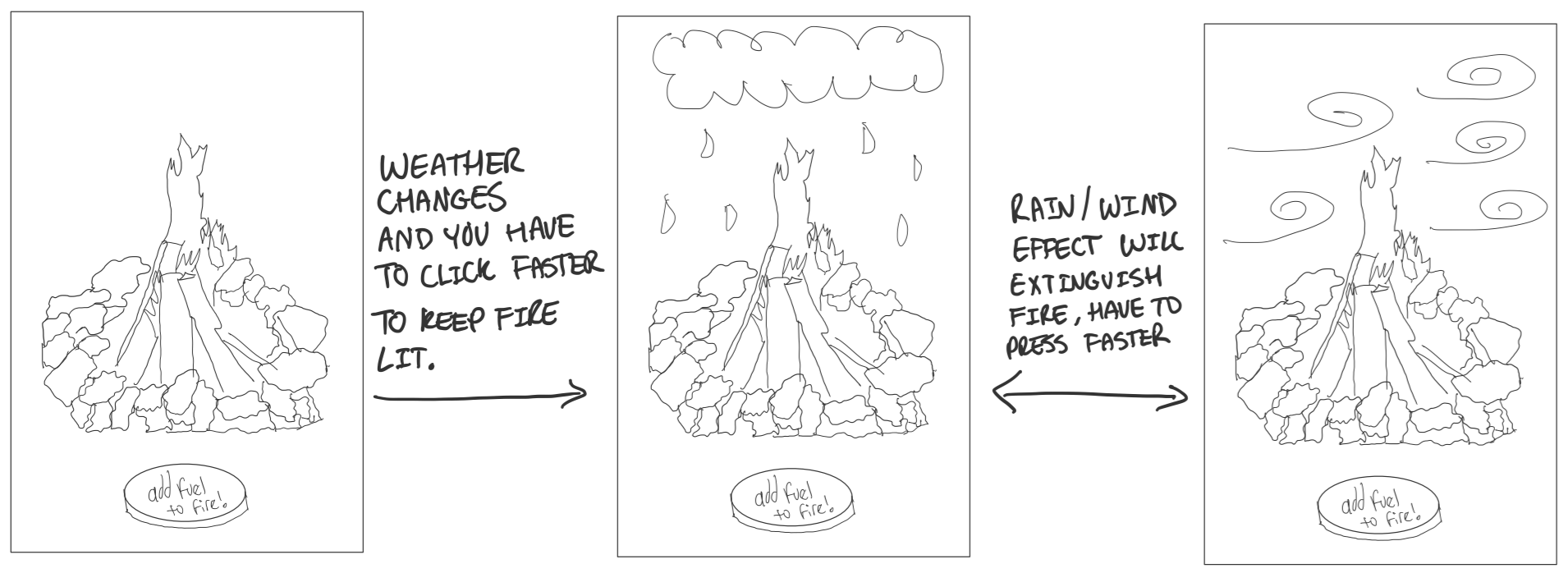
Campfire Game where you click the button to keep the fire alive against the elements. Wind and rain effects speed up the time it takes for the fire to go out.
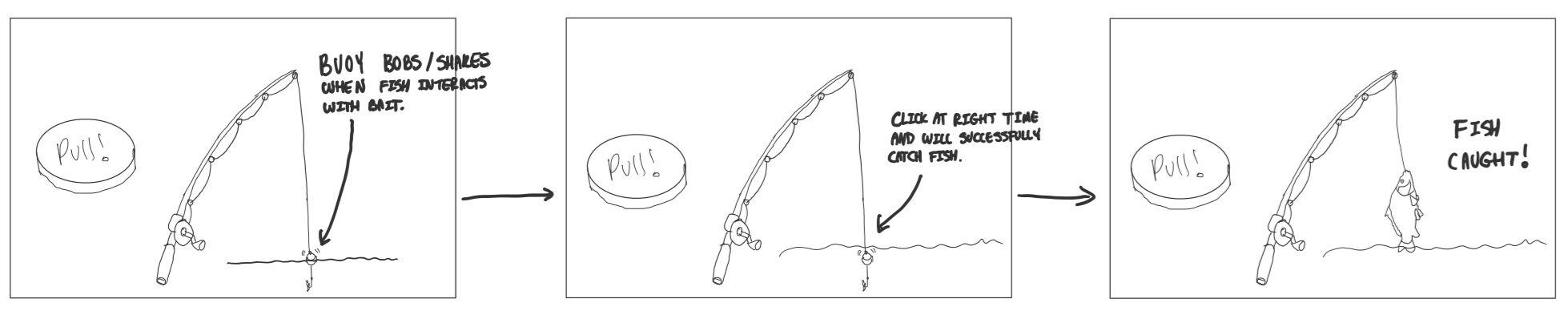
Fishing game where you have to press the button at the right time to catch a fish. The buoy bobs/shakes when fish is interacting with bait. Click before the buoy goes down and lose the fish, click when its fully down and catch fish.
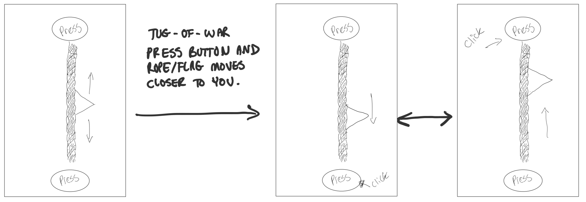
Tug of war game where two players press a button on their side of the screen to move the flag/knot closer to them. If the flag/knot reaches the threshold they win the round. New round starts.
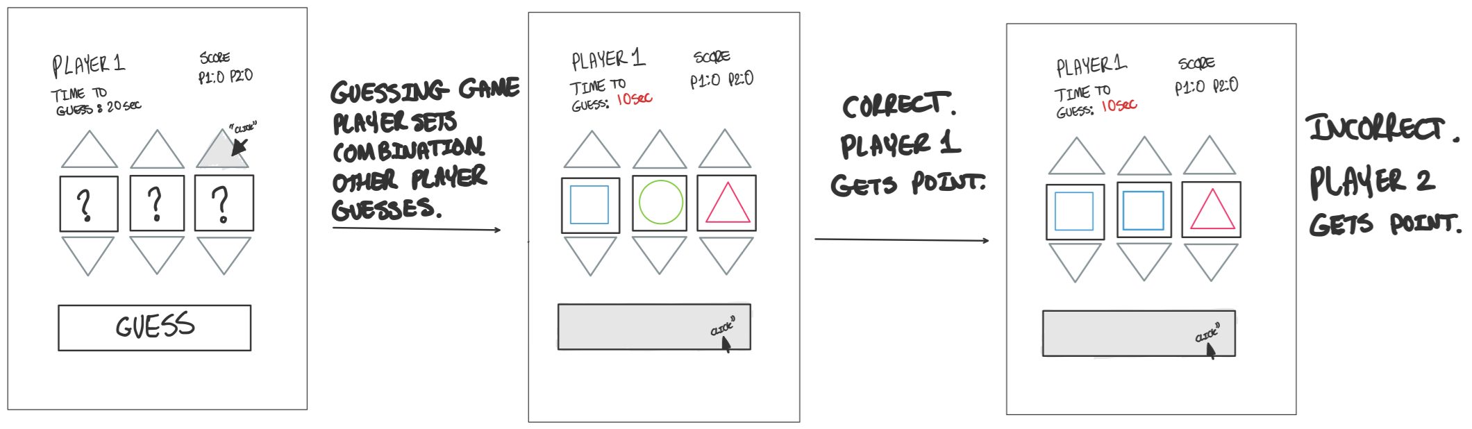
Memory game where user will be prompted to remember than guess the order and combination of shapes shown to them. If they guess it correctly they get a point, if they get it wrong the other player gets a point and they switch turns.
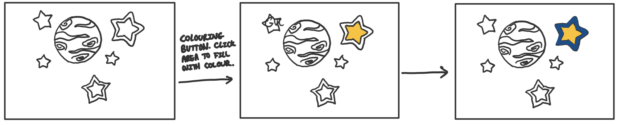
Colouring game meant for all age groups. Simple game where player clicks on outlined uncoloured section and it is coloured in with a predetermined colour.
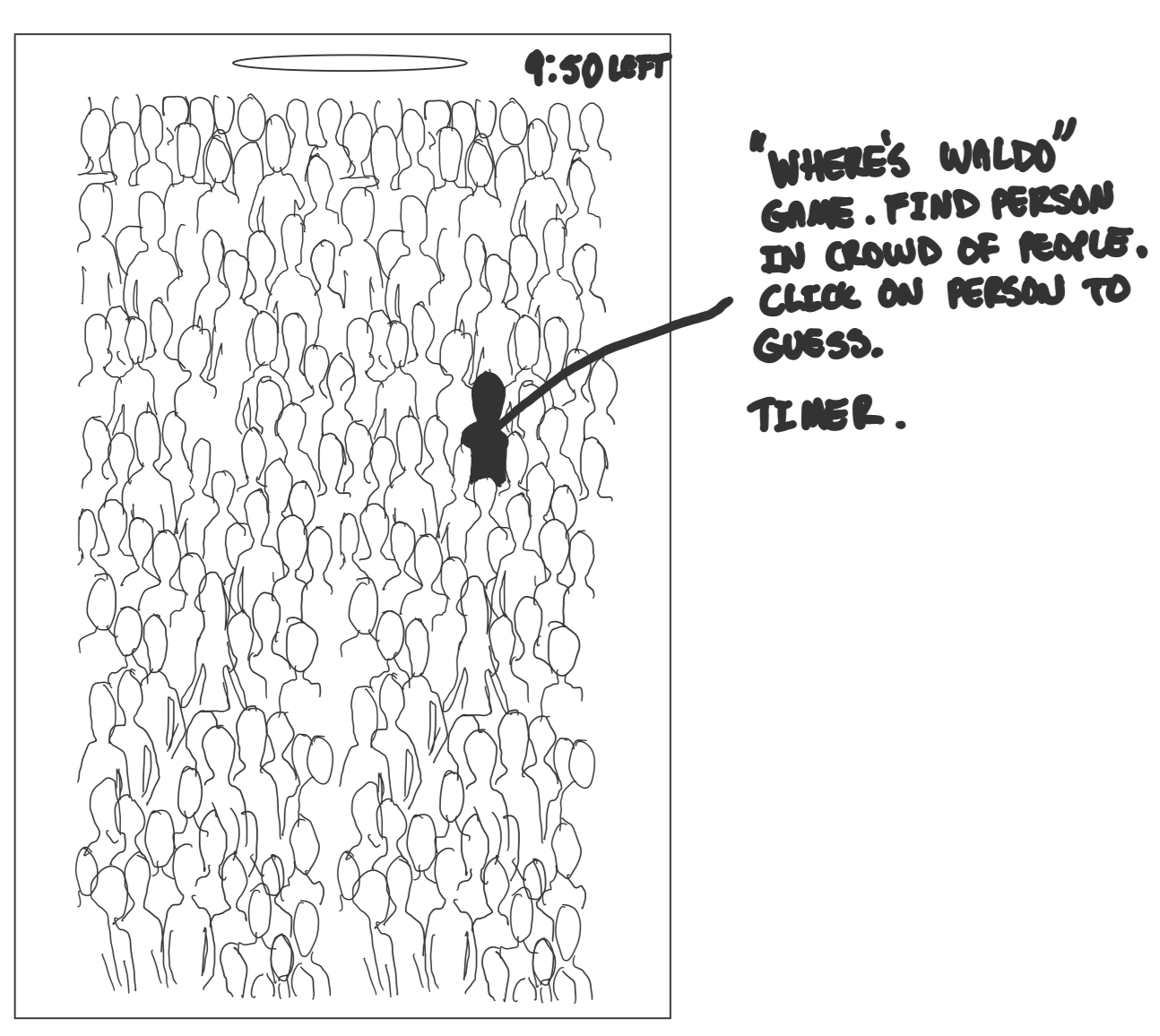
Where's waldo style game. Find person in crowd of people. Click on person to guess. Player only have a certain amount of time to guess or they lose.
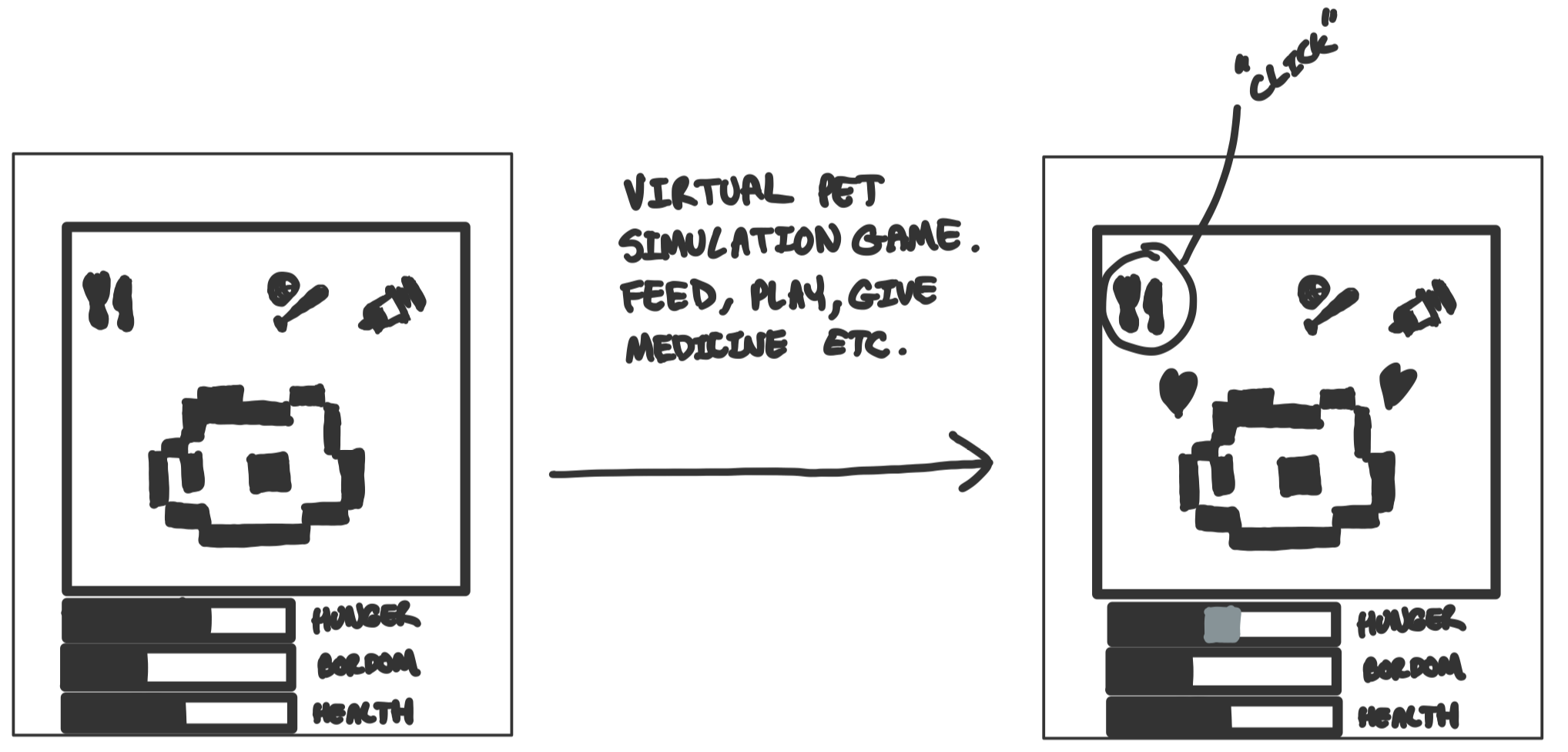
Virtual pet simulation game. Player takes care of virtual pet by making sure none of their status bars go empty. Feed, play with and give medicine to pet when they are sick.
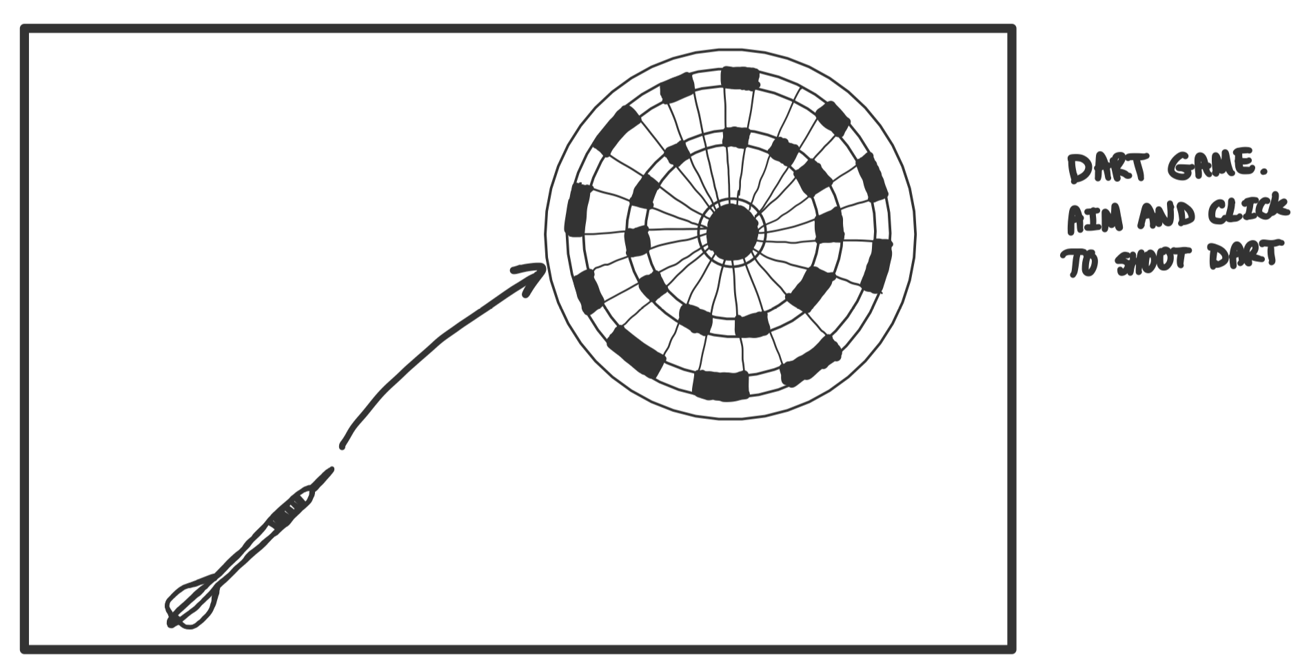
Dart game where player changes angle of dart path and clicks dart to shoot it. Middle is more points, normal rules of standard darts.
Plant game where you press either the sun or clouds to grow plant. Too much rain and the plant dies and too much sun and the plant dies.
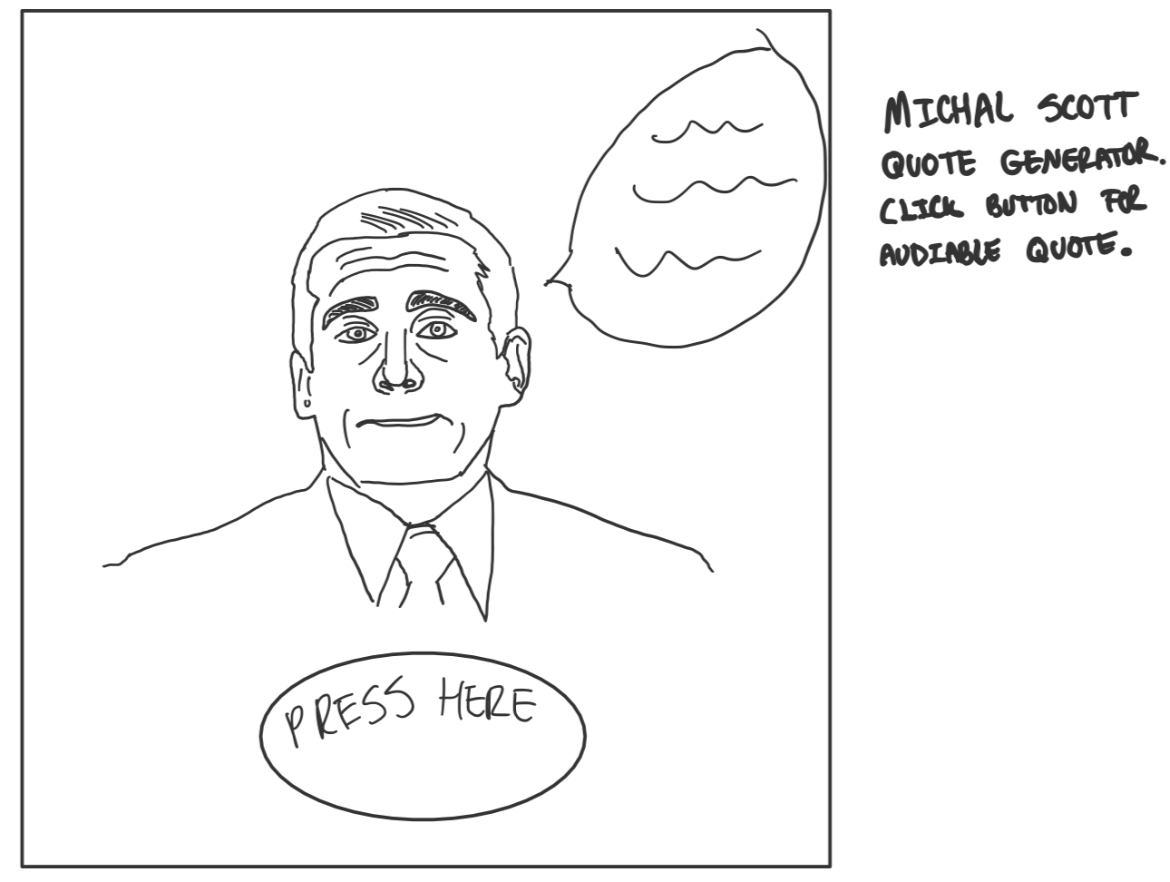
Michael Scott Quote Generator. Press button to get a random michael
scott quote from the office!
Detailed Sketches:
After we had chosen to move forward with the tug of war game, we
decided to sketch in detail some of the different parts we wanted to
be added to the game. These sketches included the various button
designs versions we had gone through in order to pick our final
ones. The pulsing button design we were thinking about, which
pulsates and goes darker. The position of the button moving as you
click it. Player scores being added onto the screen as users win
games. A moving flag to help identify which way the rope is going.
Integrating multi-touch features which allows the user to click
multiple spots on the screen at once. A full screen button allowing
the users to play the game in full screen. Adding a win screen when
a player wins allowing them to see the score and restart the game.
Making the background a gradient in order to add more depth while
also allowing the user to see who’s winning. Lastly, a moving bar to
allow the user to make a stronger pull while also adding a drawback
if they hit it as the rope moves the other way.
Detailed Sketches
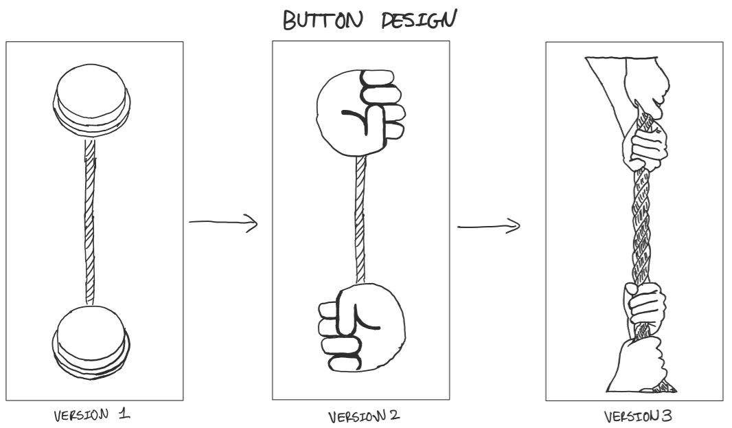
Our initial design was very simple just as a proof of concept, but it did not have the feel or the look of a tug of war game. We started by changing it to a hand emoji but it once again did not deliver the look of a tug of war game. We experimented with animating the hands to demonstrate pulling, as well as a button that moves. We had to scrap the animation due to technical challenges. We also scrapped the moving button idea since it felt gimmicky.
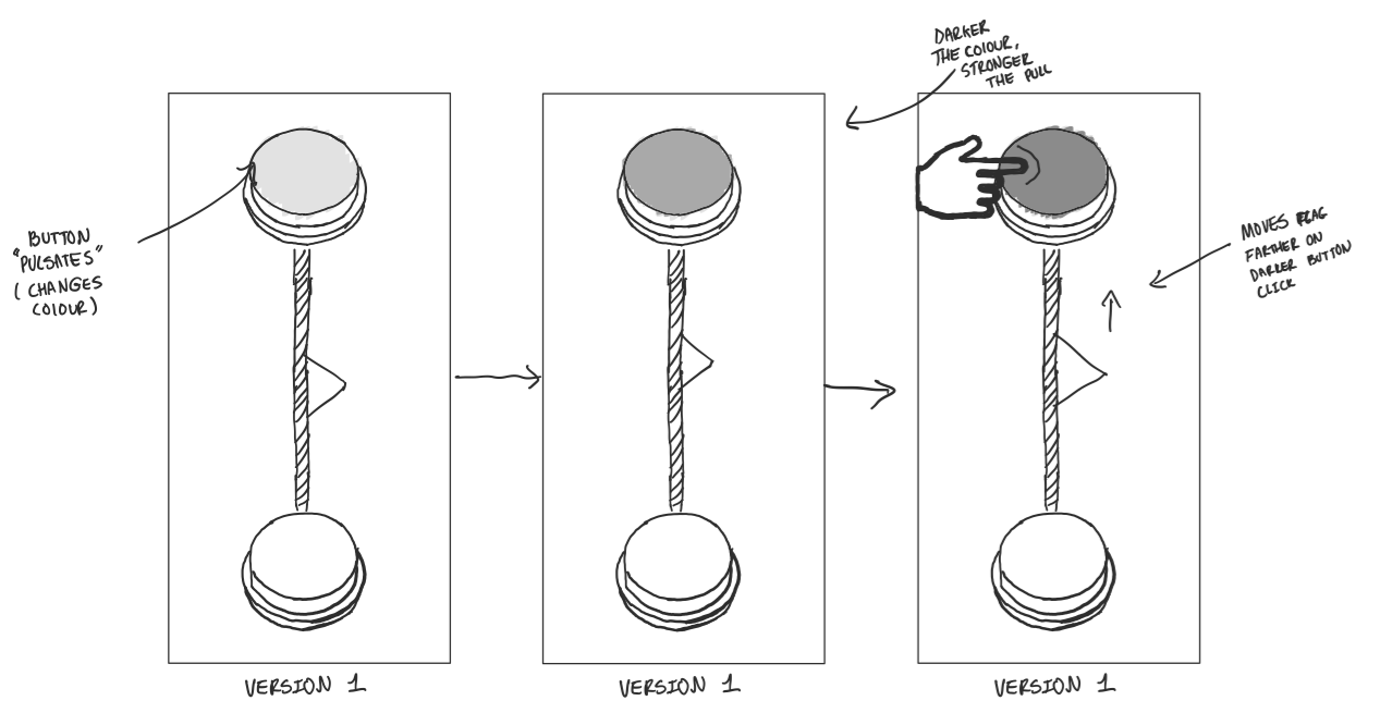
This feature was thought of by Navjot as we thought the game needed to have more depth than just spamming the button. This is why he thought of the idea to make the button become darker at times so the user has to time it in order to have a stronger pull.
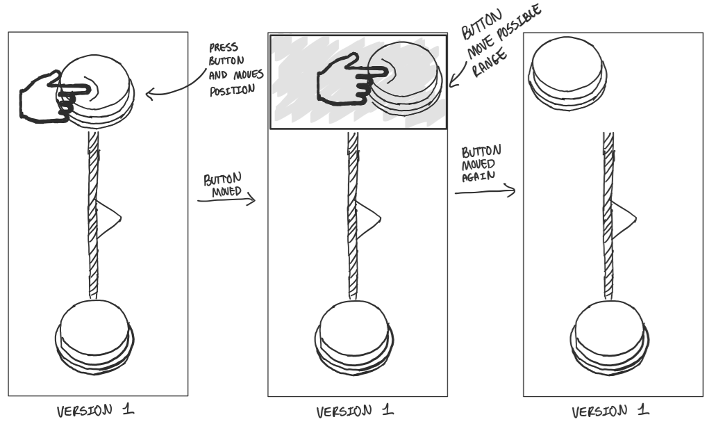
The moving button idea was suggested by fysal after discussing how to make the interaction with the button more dynamic. Instead of the player interacting with a static fixed button the button would move around within a bounded space. The benefits of this implementation would be that players would be penalized for trying to mash the button without having to think. Alternatively, players would have to be paying attention to the button shifting position if they wanted to keep the lead. Failure to do so would result in wasted time clicking the previous button location. This system would reward attentive players who are both visually “connecting the dots” between their physical senses (touch) and visual senses (sight). Although this would add a layer of depth to the game space the issue is that since we transitioned from a button to a physical rope spread across the screen with two hand-shaped buttons constituting players holding a rope (hence the theme of tug-of-war). Therefore, having the button move and thus detach from the rope itself is jarring and breaks the logical take away of two players tugging on a rope. We ultimately decided to not incorporate this feature in our final design, even so, it gives a different perspective to the game that could be a feature in a variation of the tug of war concept.
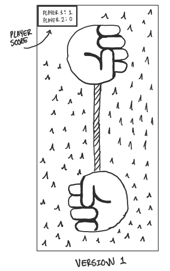
The idea for a scoreboard was a collective idea we had early in the design process. We knew that any two player game should accommodate a competitive player base who are focused on the winning/losing aspect to the game. To deal with this we knew we had to have some way of keeping track of player score. This early concept sketch shows a corner scoreboard showing player 1 and 2 scores displayed in the user interface. As our game is intended to be played on a mobile device, we did not want to clutter the UI with a scoreboard. Instead, we ended up opting for a win screen that would be displayed after a round is complete.
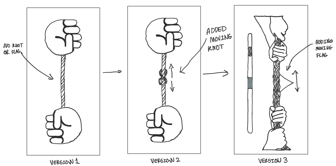
Our first iterations used a knot in the middle that would move towards the winning player. Later we learned that real tug of war actually uses a flag instead of a knot, so we decided to replace it with a flag for our final version.
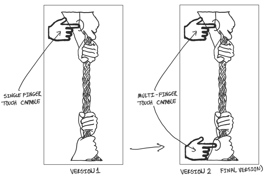
This was one of the most important functions that we had to implement. We needed our game to be multi-touch capable so the gameplay feels smooth. Before implementing this feature, we were discussing other ideas such as the pulsing button to make the game more turn based.
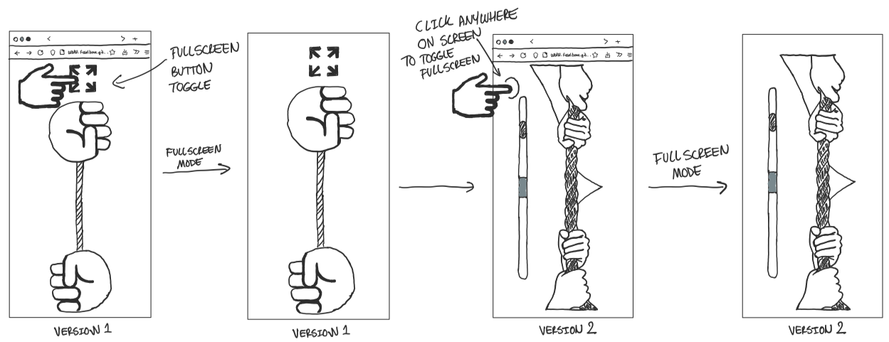
The game did not feel as immersive as a “game” like with a visible browser nav bar. So we collectively decided we would need to make our game fullscreen. We initially had a button to make the window fullscreen. But we felt that it looked terrible and cluttered the screen, so instead we implemented a feature where if you tap anywhere on the screen except the hands, it will make the window fullscreen. If it is already in fullscreen, then it will go back to windowed mode.
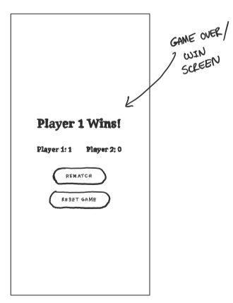
This is the game win screen, when a player wins they see this screen. We decided on this instead of a scorecard on the main game screen because the scorecard would clutter up the main game window. The rematch button allows the players to keep playing without resetting the score. The reset game button resets the scores and the game.
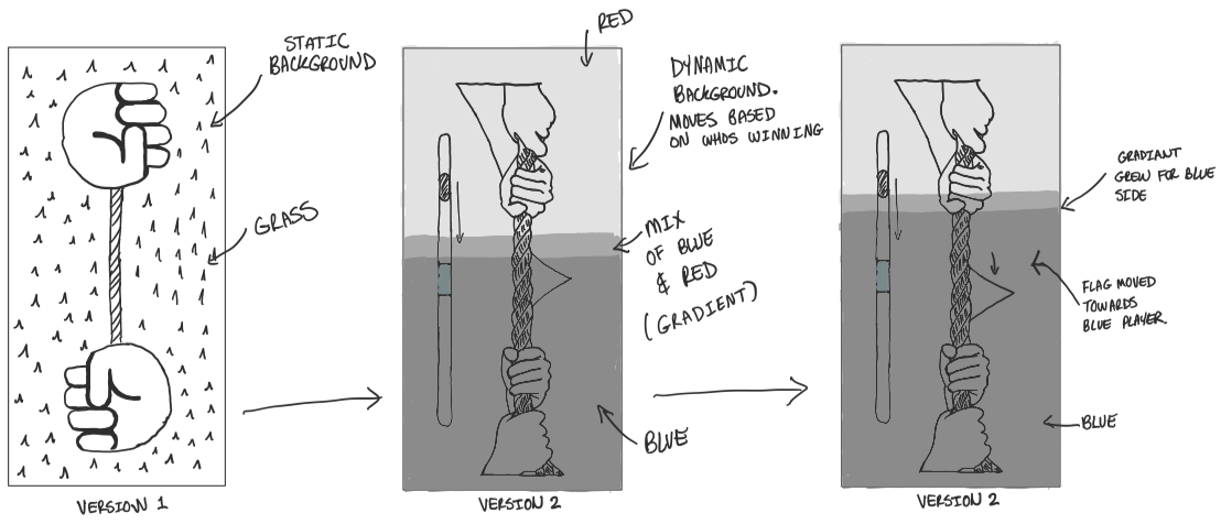
The gradient idea was suggested by Andy because we thought the game felt very boring with a static grass background and a small moving knot. It is a red and blue gradient, the color of the winning player slowly starts taking over the screen. The closer a player is to winning, the more of the screen is taken up by their color. This served as a secondary feedback to the user and observers. It makes it very clear who is winning even to somewhat distant observers that cannot see the flag. We decided to get rid of the screen counter because the flag and gradient background felt it was enough to convey game state to players, and the score box would clutter the game screen.
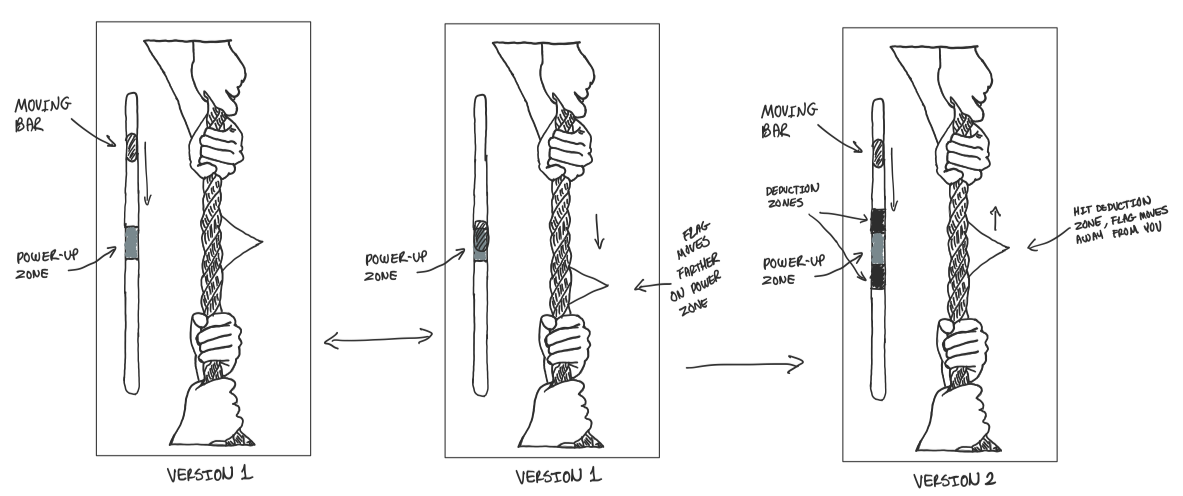
The power bar idea was suggested by Harprabh after discussion with the TA and the prof about the feel and interaction of the game. We wanted to move away from two users just mashing the button as fast as possible and add more depth to the interaction while keeping the overall feel of the game the same. Our initial iteration had a bar with a small white section in the middle with a “slider” bar constantly moving up and down. If the user taps the button when the slider is on the white section, then that user gets a larger pull distance compared to tapping while the slider is in any other part of the bar. But this version did not change the interaction from two people mashing the keys since it was still the optimal strategy to win. Then we decided to add a black zone on either side of the white zone. This zone was created to “punish” the user for tapping the button if the slider was in the black area, instead giving the opponent a large pull distance toward their side. Tug of War is a little more complex than simply pulling as hard as possible. So game mechanics based on some rhythm and timing made sense. The black bar incentivises users to time their hits rather than button mash alone. Tug of War is still a game of strength so button mashing wasn’t eliminated entirely. The button mashing in the clear ends of the power bar simulates strenuous pulling during a real match, while the timing around the black/white bars simulates the timing and rhythm components of the game. We also decided to make the bonus points of landing in the white zone to be five times the normal points. This incentivizes players to take risks by focusing on the timing/rhythm aspect. They must now decide if they wish to play it safe by momentarily pausing as the small bar enters the punishment area or they can gamble and try to win very quickly by hitting the sweet spot in the white zone.
Contribution:
I made the initial setup of the
game after we decided to go with Tug of War. My group liked the
direction I took it in so we decided to go with that version. The
rest of the game was built upon my initial setup. I also helped
troubleshoot problems that group members went through. CSS alignment
was very challenging for all of us, I helped with debugging and
making it look nice. The group also decided to go with my detailed
sketches on all their portfolios because they looked the best.
Limitations and Issues:
One of the most glaring issues in our system is how the gradient and
flag moves. The flag moves towards the winning player, but the
winning player’s color moves toward the loser’s side from the
winner’s side. This can be jarring for some users because the only 2
moving parts in our app move in 2 different directions. After
discussing with the TA, we came up with two possible solutions, one
being the whole screen slowly becomes the winner’s color and the
other being able to expand the color gradients from the center to
the player. Since we had this discussion the day before the due
date, we could not implement both features and decided to keep our
original implementation. The second issue being lack of instructions
provided to the user about the power bar. It might not be intuitive
from the start that the black zone is a punishment zone and the
white zone is a “sweet spot”.